This image was sent to her group:
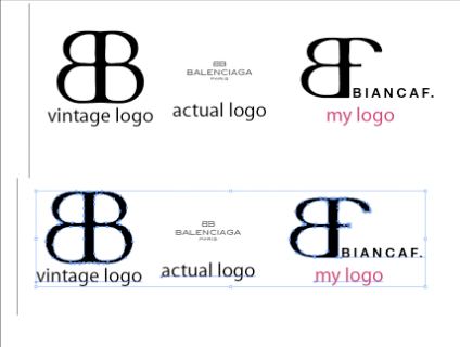
Whether from Balenciaga's vintage logo or current logo, it is obvious she copied it. The vintage one. Fine. What point are you proving? That you went into Photoshop and turned one B into an F?
Here are the two logo's we ALL have seen Bianca use:
and
Looks pretty obvious to me...

Whether from Balenciaga's vintage logo or current logo, it is obvious she copied it. The vintage one. Fine. What point are you proving? That you went into Photoshop and turned one B into an F?
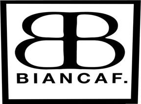
Here are the two logo's we ALL have seen Bianca use:
and
Looks pretty obvious to me...

5 comments:
that IS pretty obvious. it's even the same font
all this bashing will only hurt you store......do we need the drama ? dont think so
Funny, drama is what feeds RL news and what RL celebrities use to get back in it. Britney Spears shaving her head, Miley Cyrus's "risky" Vanity Fair photos, Paris Hilton bawling over her jail time, and so on and so forth.
Is it necessarily right? That really depends on your perspective, particularly if you're not into 'rights' or 'wrongs' and/or have taken human studies. Is it incorrect information? Again, not necessarily.
Now, here's a question for the would-be commentators: is bashing or even scolding the blog writer going to make them sing (or type) a different tune? Probably not. Your best bet is to present your own facts and avoid feelings towards the absolute end if you want to be non-inflammatory. Then, instead of spin upon spin, you'll have your own intellectual add-on.
My thoughts? Yeah, it does look like a simple copy-paste-cut job. Granted, we do see this a lot with basic or amateur creators. Not quite sure what to exactly think or feel beyond finding it silly and, perhaps at the most, lazy.
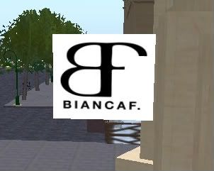
Too bad she forgot to "update" her "Logo" in all her inworld store.
Check it out @ her InStyle mall store. I was there 2 minutes ago.
Actually, its a similar, but not identical font. On the Belenciaga logo, the curves of the Bs actually connect to the riser in the middle at slightly greater than 90 degrees on both the bottom and the top. On Bianca's logo, the curves of the Bs/B and F meet the middle riser at a true 90 degree angle. Its subtle, but that does make it a different font, from a printmaking perspective.
Post a Comment